O’Fest Lager
PACKAGING, TYPEFACE DESIGN, ILLUSTRATION
PHOTOGRAPHY: DEVILS BACKBONE BREWING COMPANY
O’Fest Lager
PACKAGING, TYPEFACE DESIGN, ILLUSTRATION
PHOTOGRAPHY:
DEVILS BACKBONE BREWING COMPANY
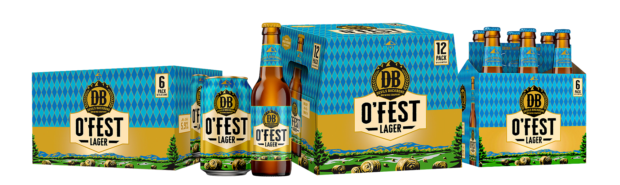
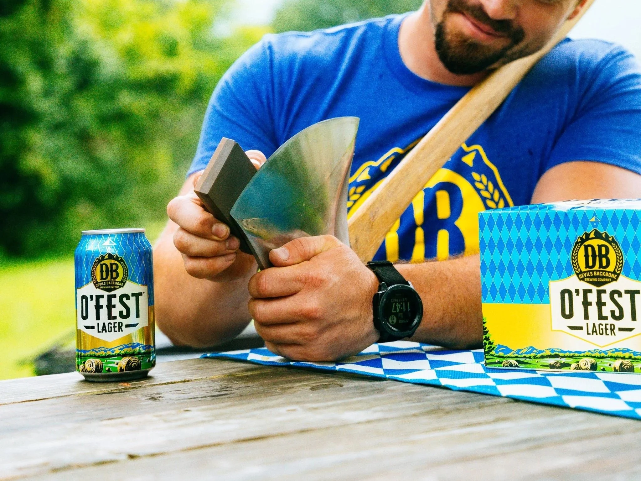
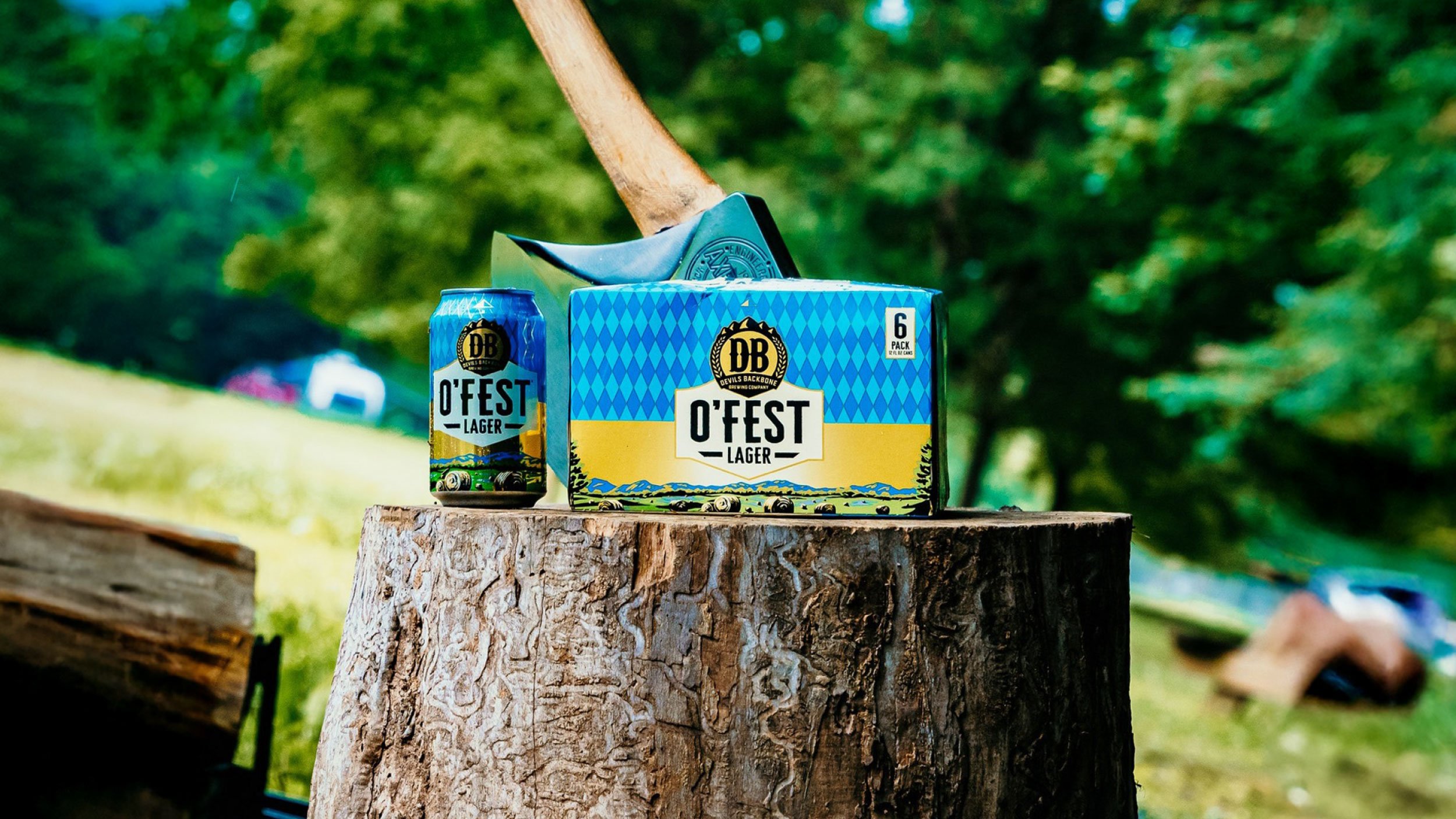
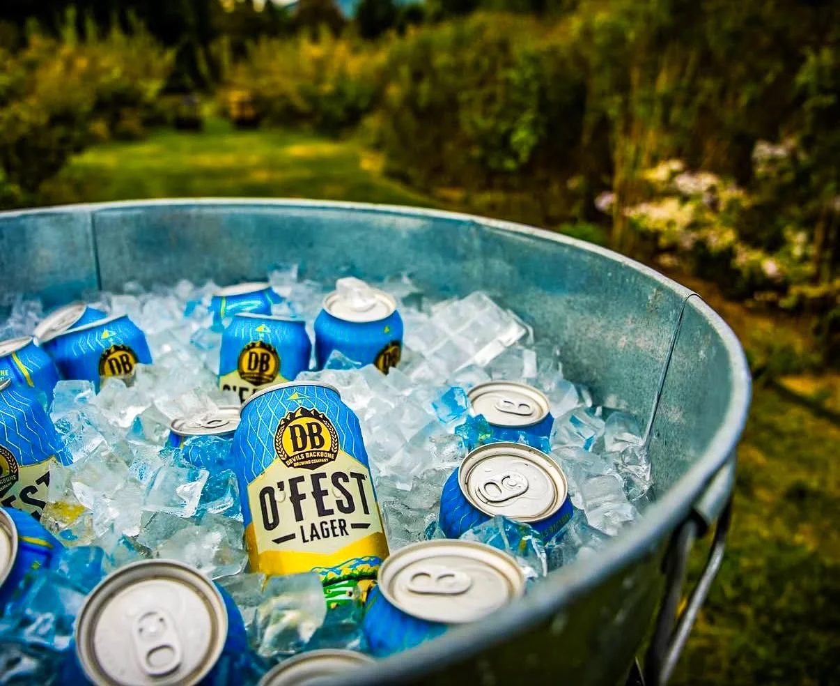
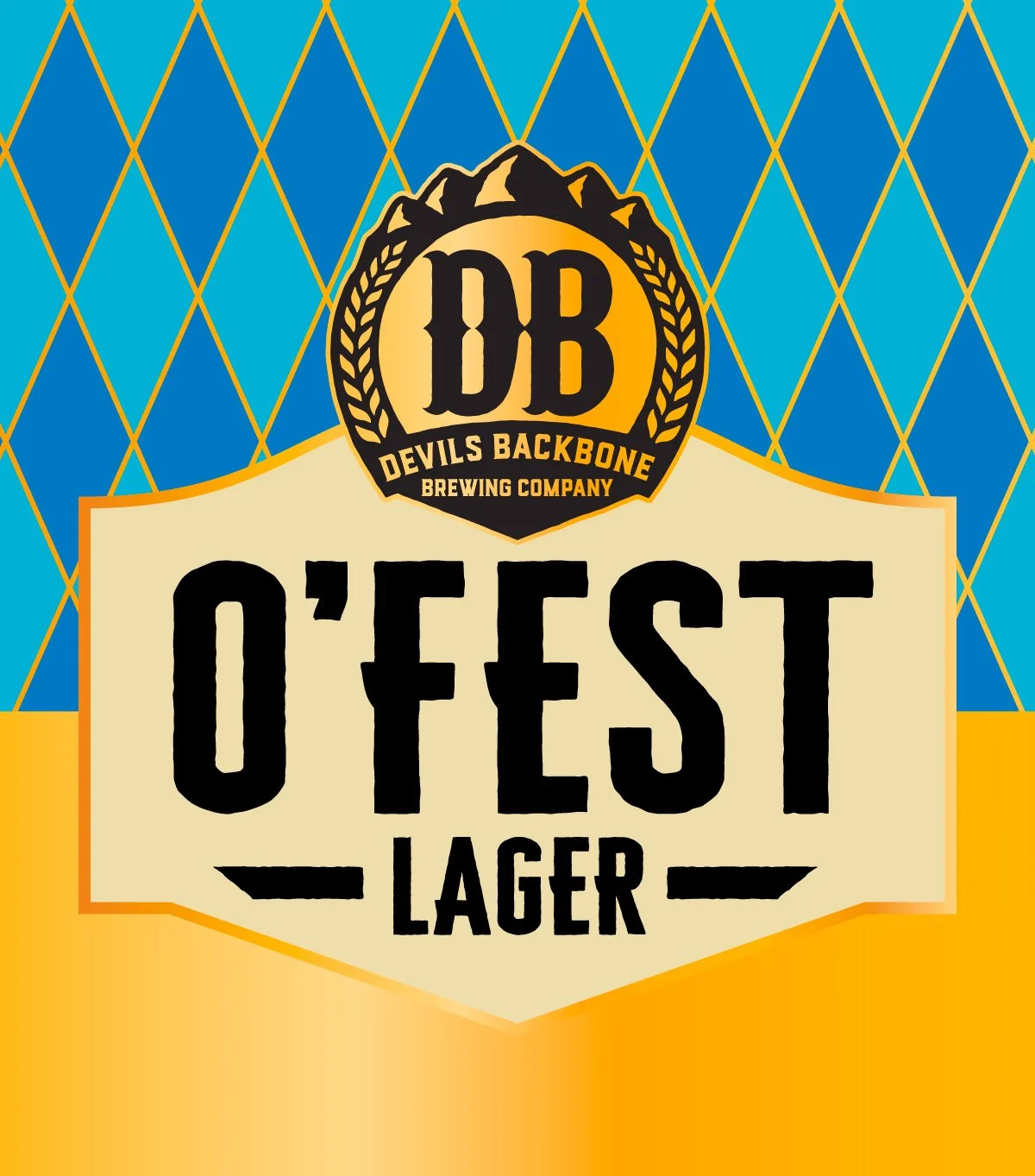
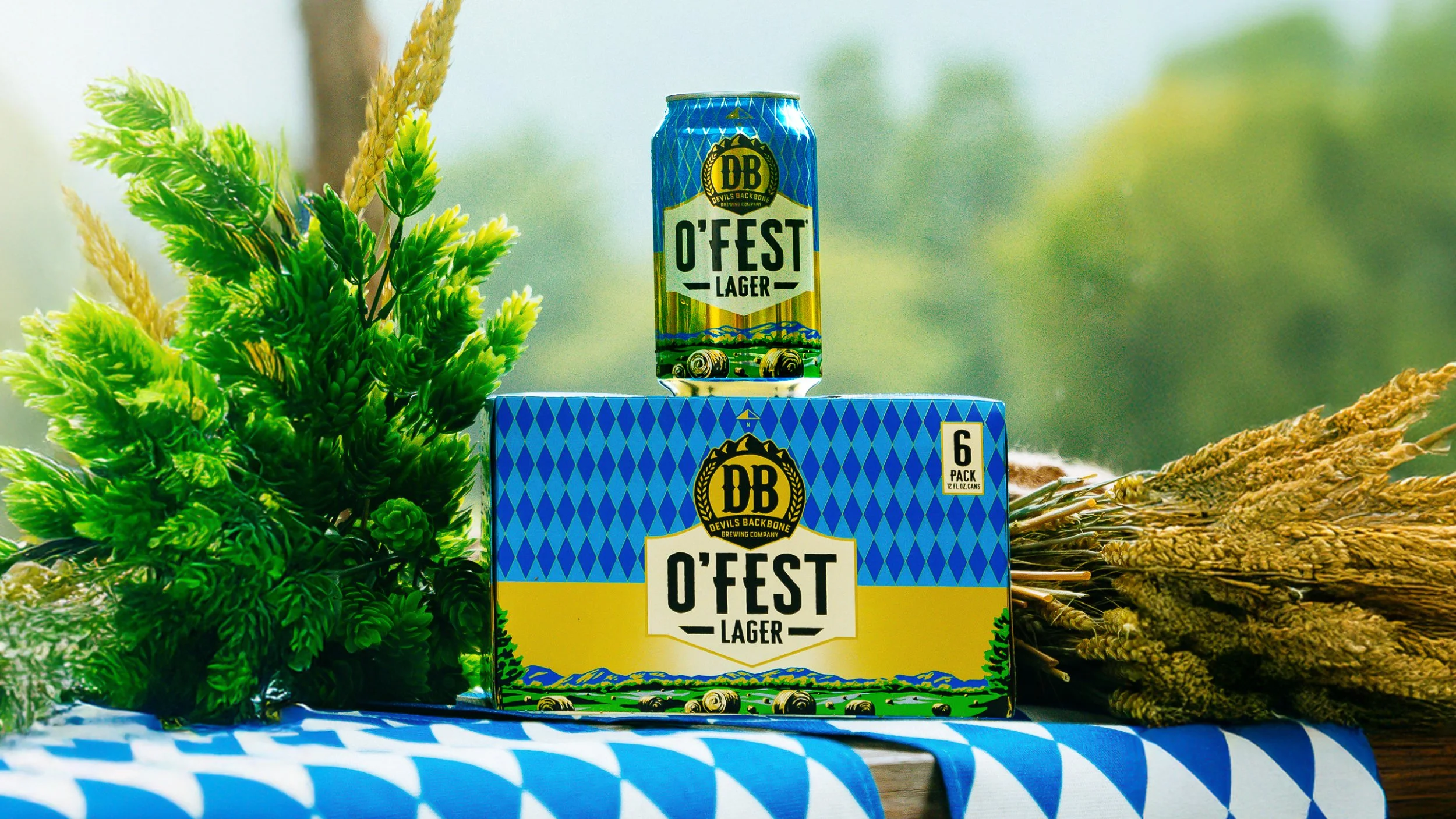
Designed as part of a larger rebrand of Devils Backbone Brewing Company's lineup of lagers, O'Fest Lager references its Virginia home with a rolling Blue Ridge Mountains illustration and pairs it with a Bavarian flag pattern that makes it immediately recognizable as an Oktoberfest style beer.
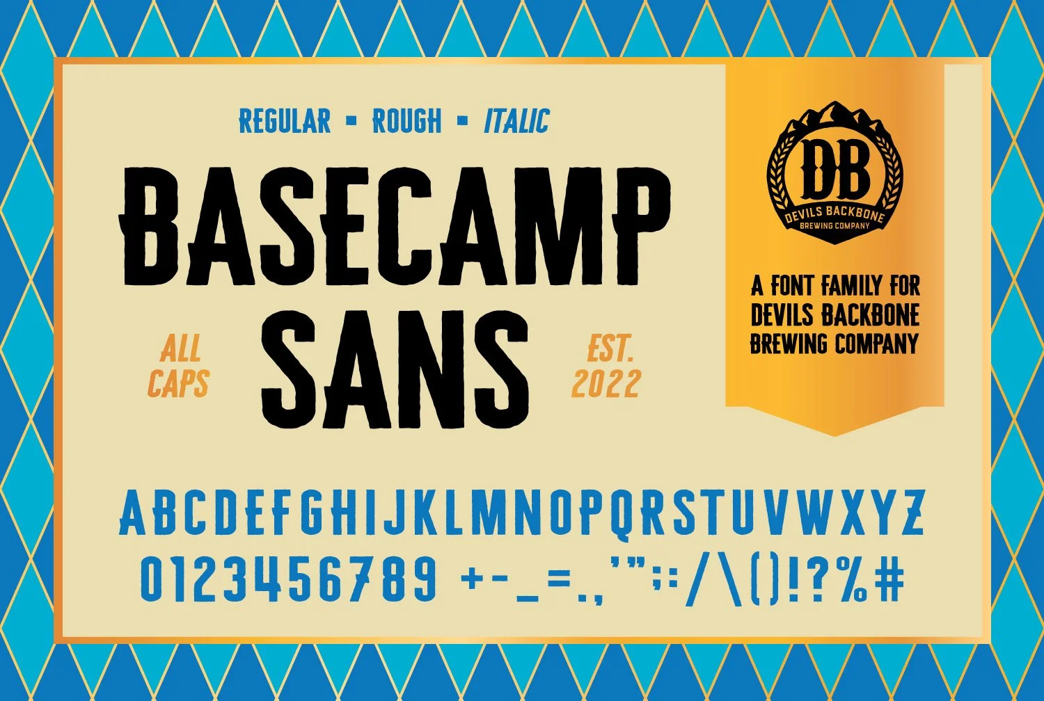
The typeface, Basecamp Sans, was named after Devils Backbone’s “Basecamp” location and developed to have a rugged, outdoorsy quality that matches the Brewery’s home in the heart of the Blue Ridge Mountains. The letterforms are tall and condensed to maximize their size and impact on the narrow real estate of a can or a bottle.